Build a Modern Digital Clock Using HTML, CSS, and JavaScript (2026 Guide)
Want to create a real-time digital clock using HTML, CSS, and JavaScript? In this beginner-friendly tutorial, you’ll learn how to build a beautiful animated digital clock with glowing circular progress indicators.
This project is perfect for:
- Beginners learning JavaScript
- Students practicing front-end development
- Developers building portfolio projects
- Anyone improving HTML, CSS, and JS skills
By the end of this guide, you’ll create a fully responsive digital clock that updates automatically every second without refreshing the page.
What You’ll Learn
In this tutorial, you’ll learn:
- How JavaScript gets the current time
- How to display hours, minutes, and seconds dynamically
- How to create animated circular progress bars
- How to build responsive layouts with CSS Flexbox
- How to improve UI with glowing neon effects
- How to optimize JavaScript performance
Live Features of This Digital Clock
✔ Real-time clock updates every second
✔ 12-hour AM/PM format
✔ Animated circular progress indicators
✔ Responsive design for mobile and desktop
✔ Modern neon UI design
✔ Beginner-friendly code structure
Prerequisites
Before starting, make sure you understand the basics of:
- HTML
- CSS
- JavaScript
You’ll also need:
- A code editor like Visual Studio Code
- A modern web browser
Project Structure
Create the following files:
index.html
style.css
script.js
Step 1: Create the HTML Structure
The HTML creates the layout of the digital clock.
Create an index.html file and paste the following code:
<!DOCTYPE html>
<html lang="en">
<head>
  <meta charset="UTF-8" />
  <meta name="viewport" content="width=device-width, initial-scale=1.0" />
  <meta name="description" content="Learn how to build a modern digital clock using HTML, CSS, and JavaScript with animated circular progress bars." />
  <meta name="keywords" content="digital clock html css javascript, javascript clock project, html css js projects" />
  <meta name="author" content="Your Name" />

  <title>Digital Clock Using HTML CSS and JavaScript</title>

  <link rel="stylesheet" href="style.css" />
</head>
<body>

  <div class="container">

    <h1 class="title">Digital Clock</h1>

    <div id="time">

      <!-- Hours -->
      <div class="circle" style="--clr:#ff2972;">
        <div class="dots h_dot"></div>

        <svg>
          <circle cx="70" cy="70" r="70"></circle>
          <circle cx="70" cy="70" r="70" id="hh"></circle>
        </svg>

        <div id="hours">00 <span>Hours</span></div>
      </div>

      <!-- Minutes -->
      <div class="circle" style="--clr:#fee800;">
        <div class="dots m_dot"></div>

        <svg>
          <circle cx="70" cy="70" r="70"></circle>
          <circle cx="70" cy="70" r="70" id="mm"></circle>
        </svg>

        <div id="minutes">00 <span>Minutes</span></div>
      </div>

      <!-- Seconds -->
      <div class="circle" style="--clr:#04fc43;">
        <div class="dots s_dot"></div>

        <svg>
          <circle cx="70" cy="70" r="70"></circle>
          <circle cx="70" cy="70" r="70" id="ss"></circle>
        </svg>

        <div id="seconds">00 <span>Seconds</span></div>
      </div>

      <!-- AM PM -->
      <div class="ap">
        <div id="ampm">AM</div>
      </div>

    </div>
  </div>

  <script src="script.js"></script>
</body>
</html>
Step 2: Add CSS Styling
Now let’s design the clock using CSS.
Create a style.css file and paste the following code:
@import url('https://fonts.googleapis.com/css2?family=Poppins:wght@300;400;500;600;700&display=swap');

* {
  margin: 0;
  padding: 0;
  box-sizing: border-box;
  font-family: 'Poppins', sans-serif;
}

body {
  min-height: 100vh;
  display: flex;
  justify-content: center;
  align-items: center;
  background: #2f363e;
  overflow: hidden;
}

.container {
  text-align: center;
  padding: 20px;
}

.title {
  color: #fff;
  margin-bottom: 40px;
  font-size: 2.5rem;
  font-weight: 700;
}

#time {
  display: flex;
  gap: 40px;
  flex-wrap: wrap;
  justify-content: center;
  align-items: center;
}

.circle {
  position: relative;
  width: 180px;
  height: 180px;
  display: flex;
  justify-content: center;
  align-items: center;
}

.circle svg {
  position: relative;
  width: 180px;
  height: 180px;
  transform: rotate(270deg);
}

.circle svg circle {
  width: 100%;
  height: 100%;
  fill: transparent;
  stroke: #191919;
  stroke-width: 5;
  transform: translate(5px, 5px);
}

.circle svg circle:nth-child(2) {
  stroke: var(--clr);
  stroke-dasharray: 440;
  stroke-dashoffset: 440;
  transition: stroke-dashoffset 0.5s linear;
}

.circle div {
  position: absolute;
  color: #fff;
  font-size: 2rem;
  font-weight: 600;
}

.circle div span {
  display: block;
  font-size: 0.8rem;
  font-weight: 400;
  letter-spacing: 2px;
  margin-top: 5px;
  text-transform: uppercase;
}

.ap {
  color: #fff;
  font-size: 2rem;
  font-weight: 700;
}

.dots {
  position: absolute;
  width: 100%;
  height: 100%;
  display: flex;
  justify-content: center;
  z-index: 10;
}

.dots::before {
  content: '';
  position: absolute;
  top: -6px;
  width: 15px;
  height: 15px;
  border-radius: 50%;
  background: var(--clr);
  box-shadow:
    0 0 20px var(--clr),
    0 0 60px var(--clr);
}

@media (max-width: 768px) {
  .circle {
    width: 150px;
    height: 150px;
  }

  .circle svg {
    width: 150px;
    height: 150px;
  }

  .circle div {
    font-size: 1.5rem;
  }
}
Step 3: Add JavaScript Functionality
Now we’ll make the clock work in real time.
Create a script.js file and paste the following code:
const hours = document.getElementById('hours');
const minutes = document.getElementById('minutes');
const seconds = document.getElementById('seconds');
const ampm = document.getElementById('ampm');

const hh = document.getElementById('hh');
const mm = document.getElementById('mm');
const ss = document.getElementById('ss');

const dotH = document.querySelector('.h_dot');
const dotM = document.querySelector('.m_dot');
const dotS = document.querySelector('.s_dot');

function updateClock() {

  const now = new Date();

  let h = now.getHours();
  let m = now.getMinutes();
  let s = now.getSeconds();

  let ap = h >= 12 ? 'PM' : 'AM';

  h = h % 12 || 12;

  const displayH = String(h).padStart(2, '0');
  const displayM = String(m).padStart(2, '0');
  const displayS = String(s).padStart(2, '0');

  hours.innerHTML = `${displayH}<span>Hours</span>`;
  minutes.innerHTML = `${displayM}<span>Minutes</span>`;
  seconds.innerHTML = `${displayS}<span>Seconds</span>`;

  ampm.innerHTML = ap;

  hh.style.strokeDashoffset = 440 - (440 * h) / 12;
  mm.style.strokeDashoffset = 440 - (440 * m) / 60;
  ss.style.strokeDashoffset = 440 - (440 * s) / 60;

  dotH.style.transform = `rotate(${h * 30}deg)`;
  dotM.style.transform = `rotate(${m * 6}deg)`;
  dotS.style.transform = `rotate(${s * 6}deg)`;
}

updateClock();
setInterval(updateClock, 1000);
How This JavaScript Clock Works
The JavaScript code:
- Gets the current time using
new Date() - Extracts hours, minutes, and seconds
- Converts 24-hour time into 12-hour AM/PM format
- Updates the HTML every second
- Animates circular SVG progress bars
This creates a fully functional live digital clock.
Final Output
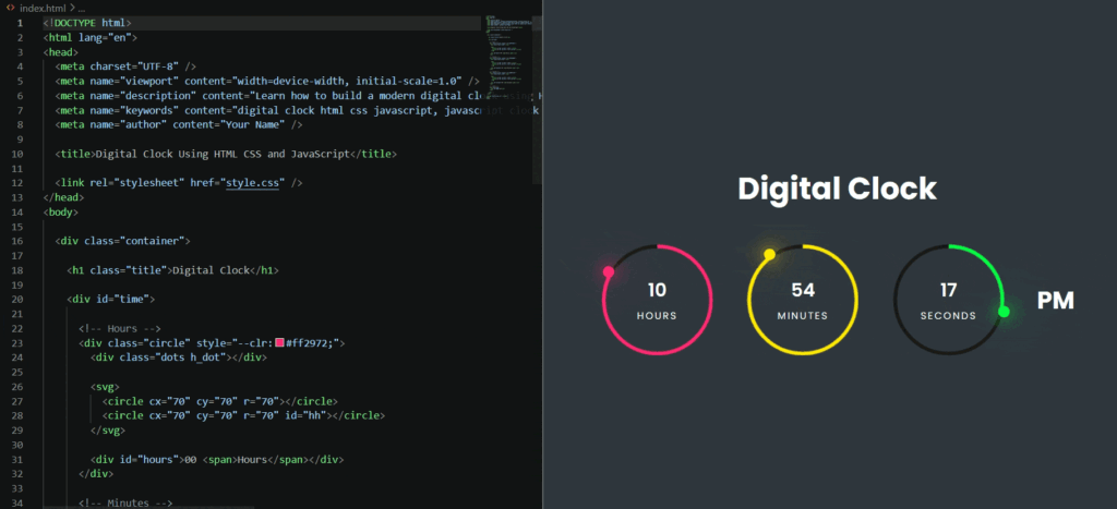
After completing all three files, your clock will:
- Show live time just like above
- Animate every second
- Display glowing neon circles
- Work smoothly across devices
FAQs
Conclusion
In this tutorial, you learned how to build a modern digital clock using HTML, CSS, and JavaScript.
This project is excellent for improving:
- JavaScript DOM manipulation
- CSS animations
- SVG progress circles
- Responsive web design skills
You can further improve this project by adding:
- Dark/light mode
- Multiple time zones
- Alarm functionality
- Stopwatch features
- Date and calendar support
If you enjoyed this tutorial, consider sharing it with other developers and bookmarking it for future reference.
Happy Coding 🚀
Download Full Project Source Code
Get complete project source code files, reusable resources and implementation examples.
Preparing Secure Download 10